FOTOfusion 2019
iPad Portrait Demo

Watch as I create a portrait live on stage at the Palm Beach Photographic Centre (PBPC) in West Palm Beach, Florida, on January 23rd, 2019, as a Community Presentation during the FOTOfusion 2019 festival. I also taught Painter classes that week in the PBPC computer labs where Wacom had kindly loaned their tablets for students to use. I will be returning to PBPC February 11 – 15, 2020 for FOTOfusion 2020 (their 25th anniversary of FOTOfusion) and in March 9 – 12, 2020, will to teach a four day Painter workshop. Click here for details. Please note that in all classes we use the latest version of Corel Painter available at that time.

Gemini


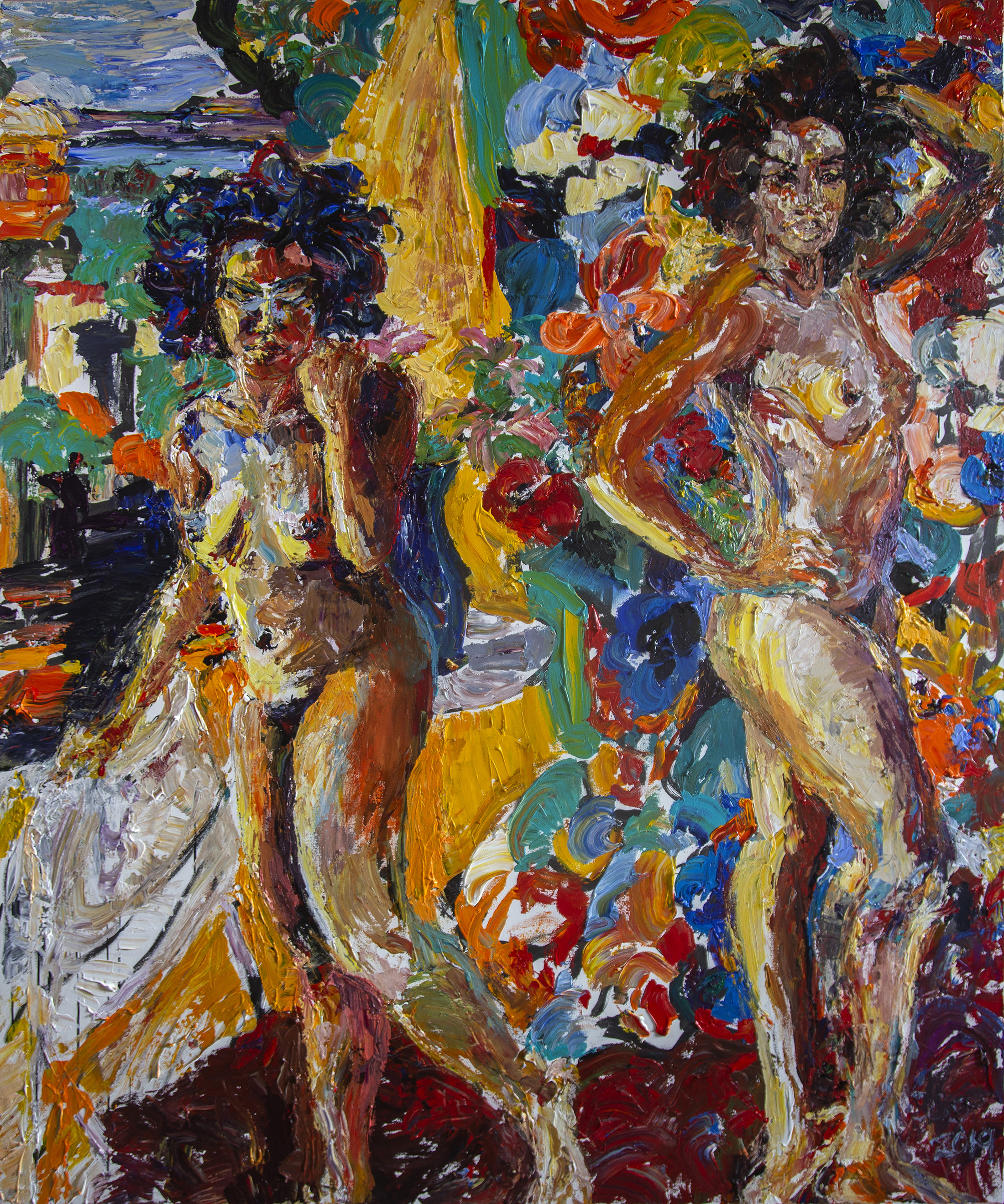
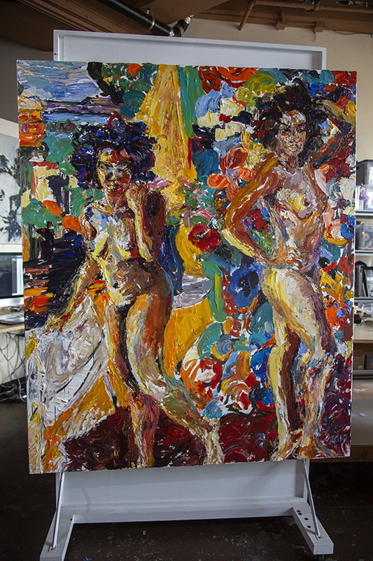
60 inches x 72 inches
Acrylic on canvas

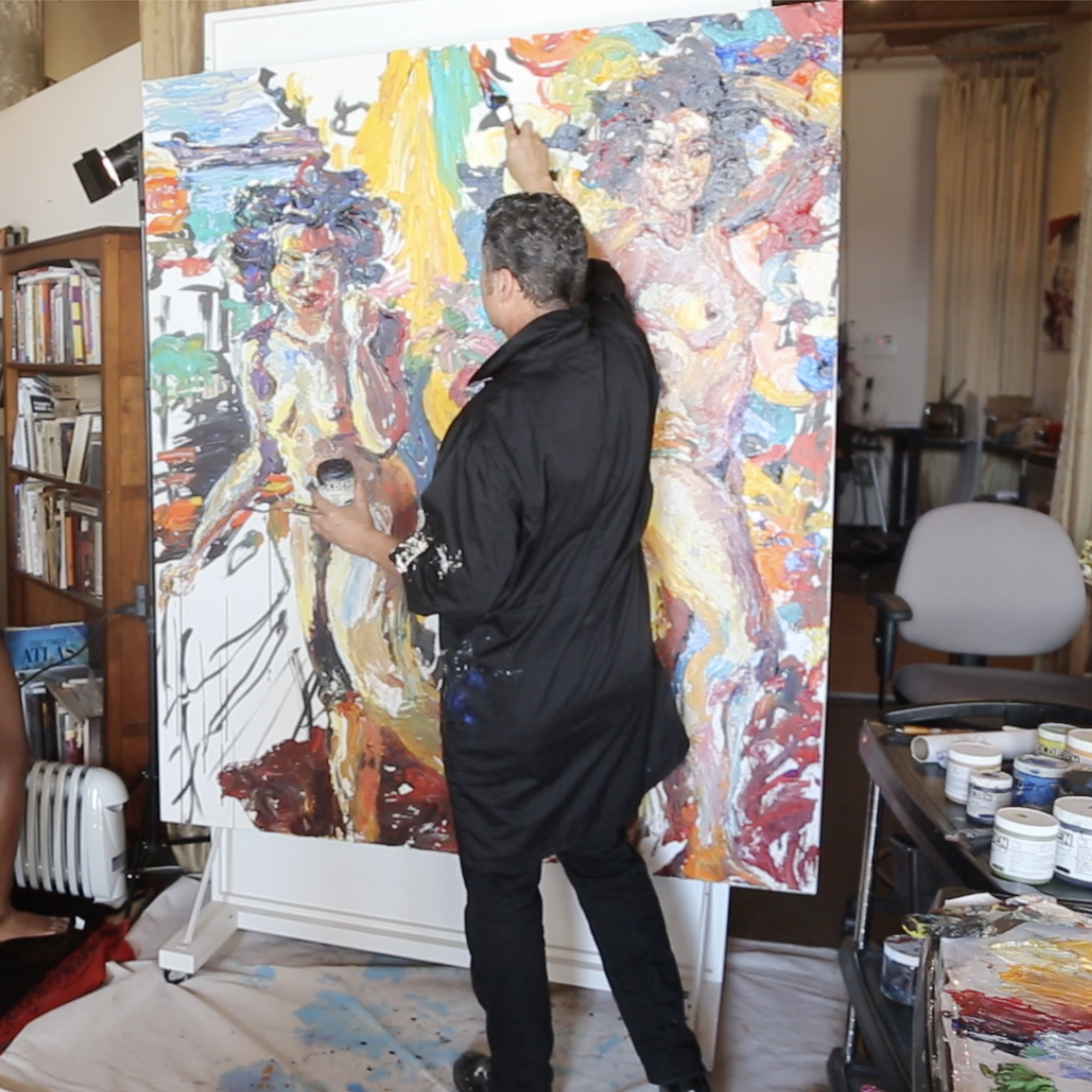
This painting was created from life. It represents two sides of my model’s personality in two different poses within the painting, resonating with her being a Gemini, the zodiac sign of the twins. When the painting was completed I ask Laurel (now known as Friday) what she saw in it. This is her answer:


Working with a scale of canvas that was taller than I and which I needed to move across as well as up and down, meant that every part of the painting is done from a difference perspective, not to mention that the lighting conditions and pose changed slightly every minute of every session and more strongly between sessions. Thus what you see is essentially the result of an infinite series of slightly different points of views, poses, lighting and perspective. This is what makes drawing and painting from life come to life for me and so fundamentally different on every level than basing an artwork on photographic reference which is so limited in points of view and lacks the dynamic change of real life from moment to moment. Besides the aspect of continual change, the other dramatic and dynamic aspect of drawing a model from life is their interaction and energy that influences and contributes to the creative process. This was a special experience for Laurel and I to share and one full of surprises for both as the painting developed it’s own voice, asking for what it needed next. Thank you, Laurel, for being such an inspiring model and muse and participating in this project!

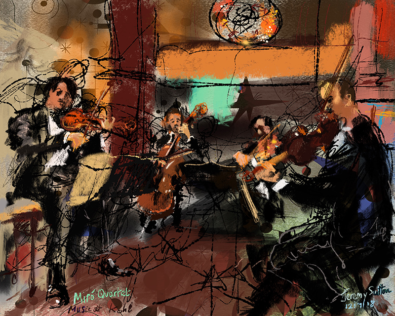
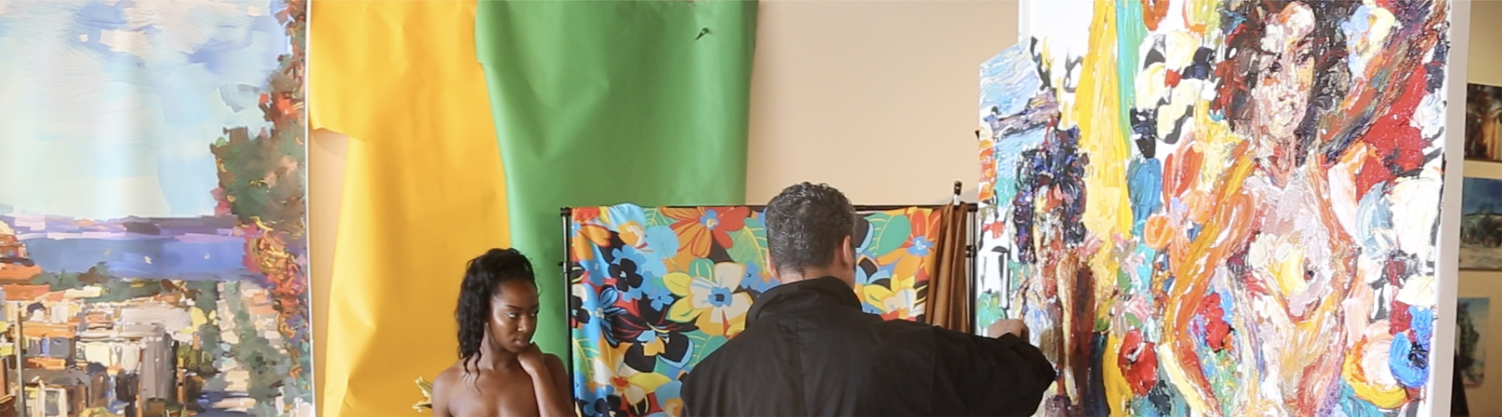
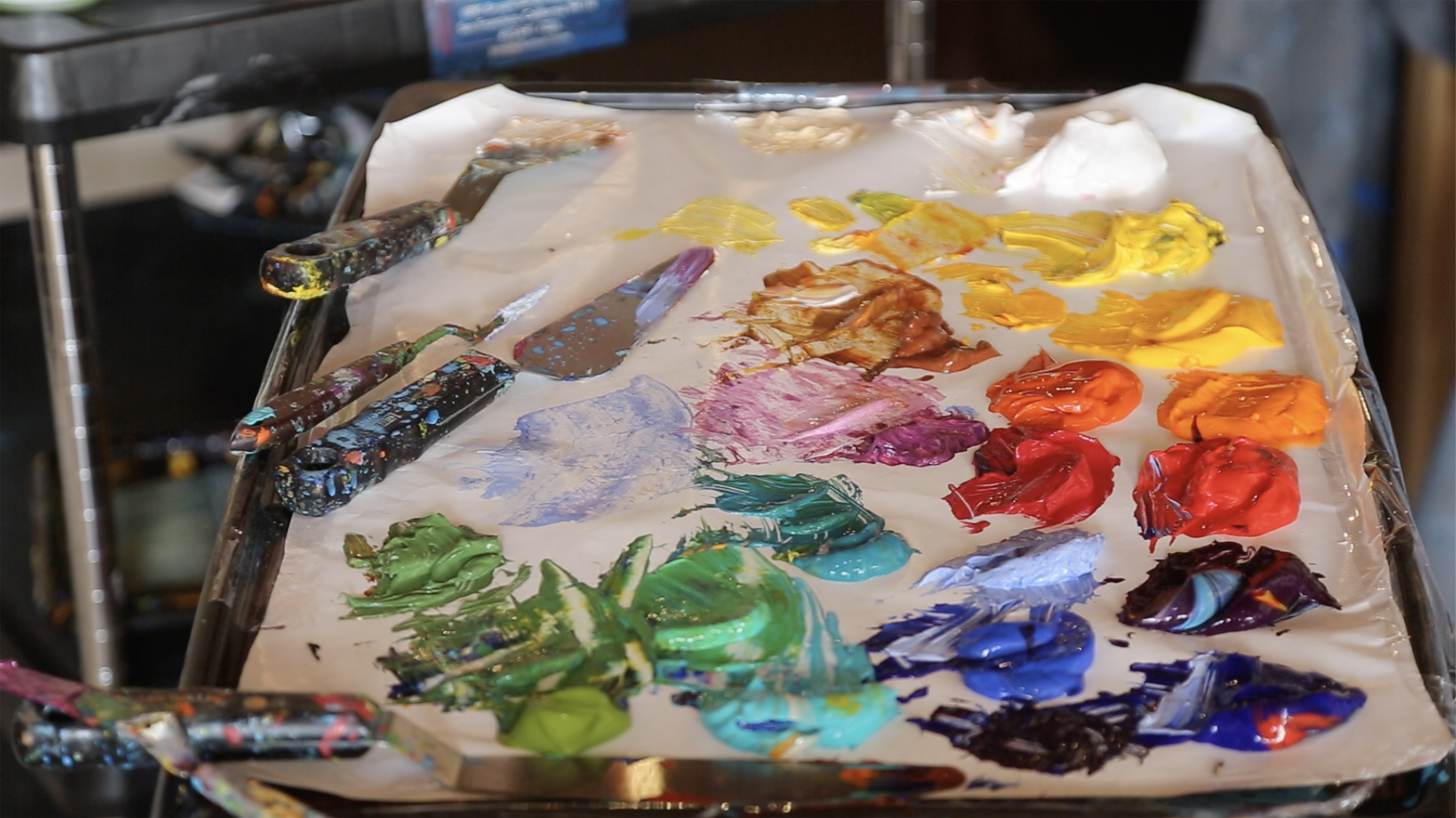
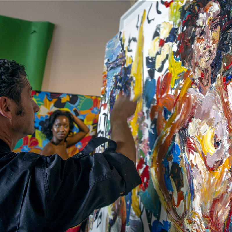
I started this portrait as one of my continuing “slow” projects. Another of my “slow” projects is my painting of Shahasp. Obviously “slow” is a relative term. I do a lot of “fast” performance art, often with the iPad as my art medium, in which I complete a portrait from life in ten minutes or visually interpret a presentation over an hour or depict a scene and capture the atmosphere of an event over anywhere from a few minutes to a few hours. Therefore working in traditional media over a series of sessions adding up to over twelve hours, as in this case, is relatively “slow” for me. My main boundary condition is that every brush stroke is done from life and based on direct observation.

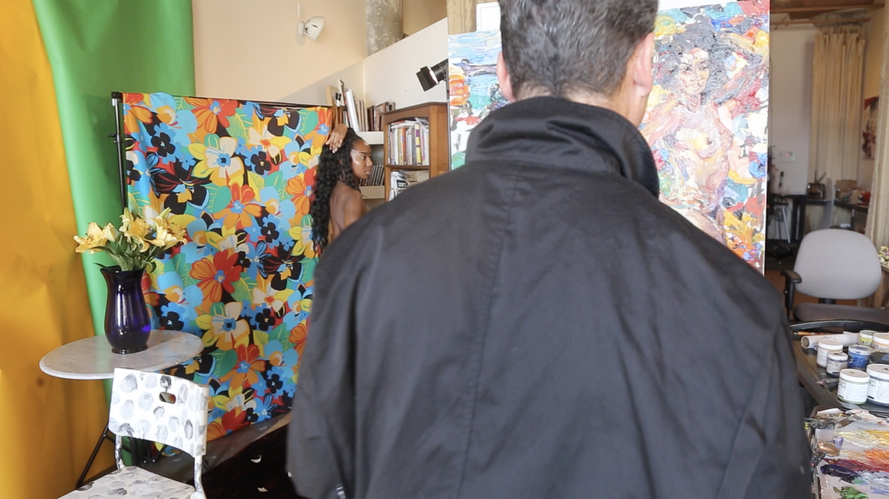
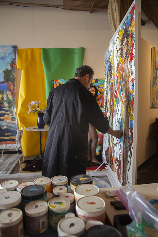
The background and set I created for this painting includes my painting “Looking Down Divis’” on the left, a chair painted by my friend and fellow artist John Warren Travis, and a Balenciaga fabric from Britex Fabrics.

This painting was shown in public for the first time during my Spring Open Studios Preview Reception on April 5, 2019.

The unveiling followed by artist and model chat where we shared some thoughts and reflections on the experience of creating this painting, Q & A, and spoken word poetry reading by Laurel, who is a philosophic poet and singer / songwriter, as well as a model.

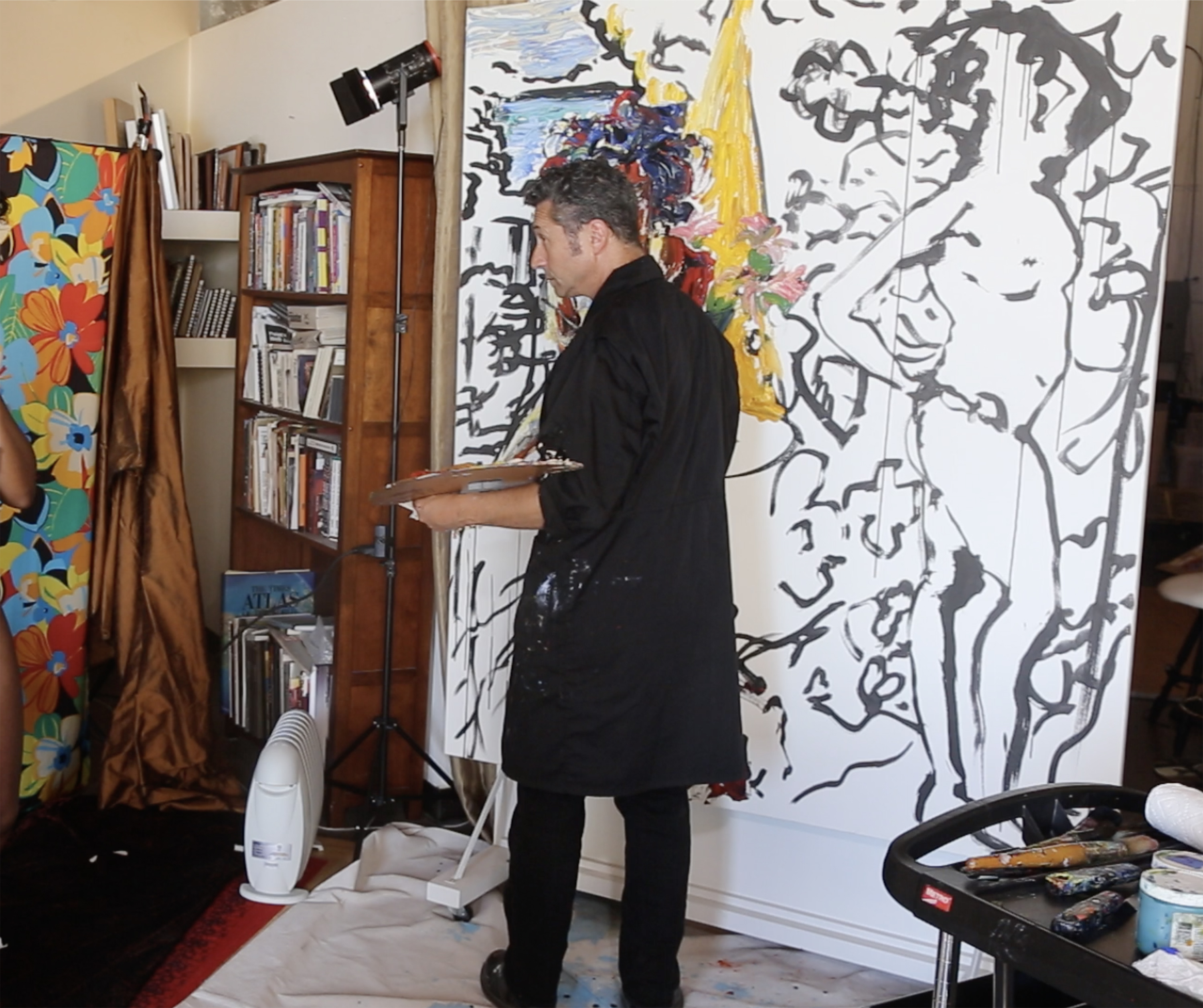
Here are photos of the stages of development of the painting from the four sessions:


Session #4: January 12th, 2019


Session #3: January 3rd, 2019


Session #2: January 2nd, 2019


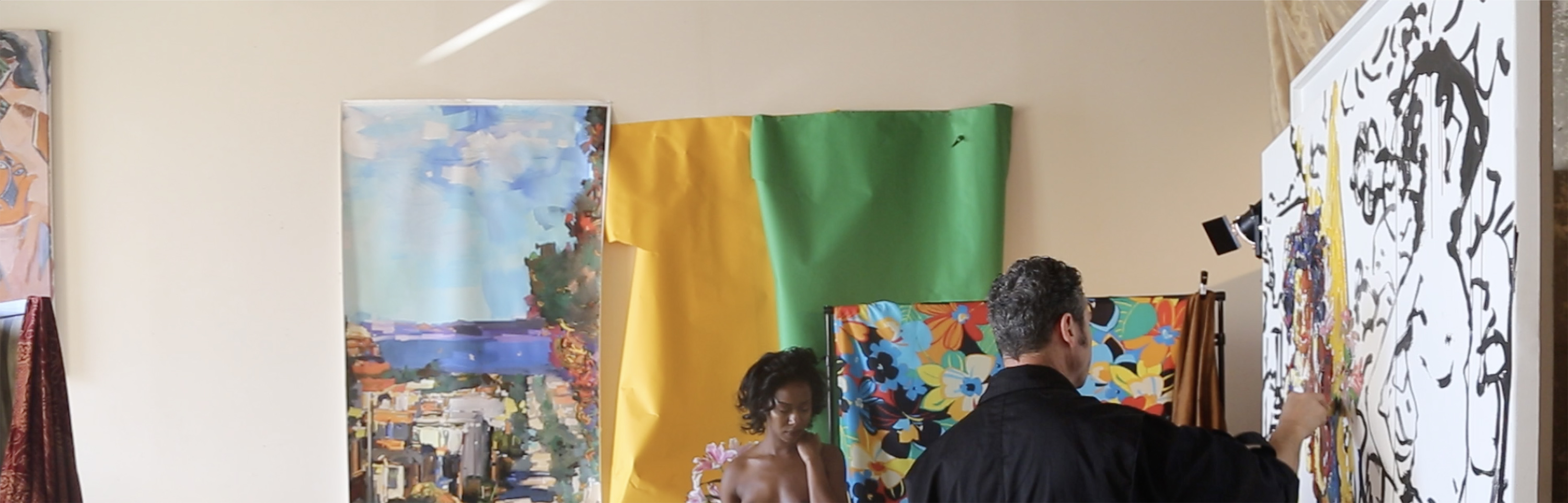
Session #1: December 29th, 2018


The Mana Quartet: In Rehearsal


This time-lapse replay video shows the unfolding of the creative process of an iPad sketch of The Mana Quartet while rehearsing in Peggy’s art studio at 1890 Bryant Studios, San Francisco.

The tools I used for this were the iPad Pro 12.9 (3rd Gen.), Apple Pencil and the Procreate app. Thank you Michael, Diane, Thomas and Michael for your inspiration!

Holiday Party at The Tech


I painted portraits of guests at the The Tech Museum of Innovation in San Jose for the PayPal Holiday Party. This was the same museum where, in 1996, I painted the portrait of Adobe Systems co-founders John Warnock and Charles Geschke. The digital tools I used were the latest iPad Pro 12.9, Apple Pencil 2 and the Procreate app. Many thanks to Genessa and her colleagues who organized this fabulous event!

Live Painting in
Michael Cerbelli’s:The Hot List
The Special Event Show

Painting The Show

This video shows a replay of the iPad painting I created live on stage documenting the entire 90 minutes of Michael Cerbelli’s “The Hot List™” 2019 at The Special Event Show in San Diego.

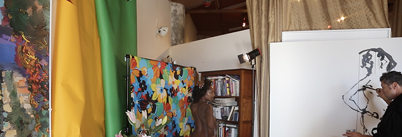
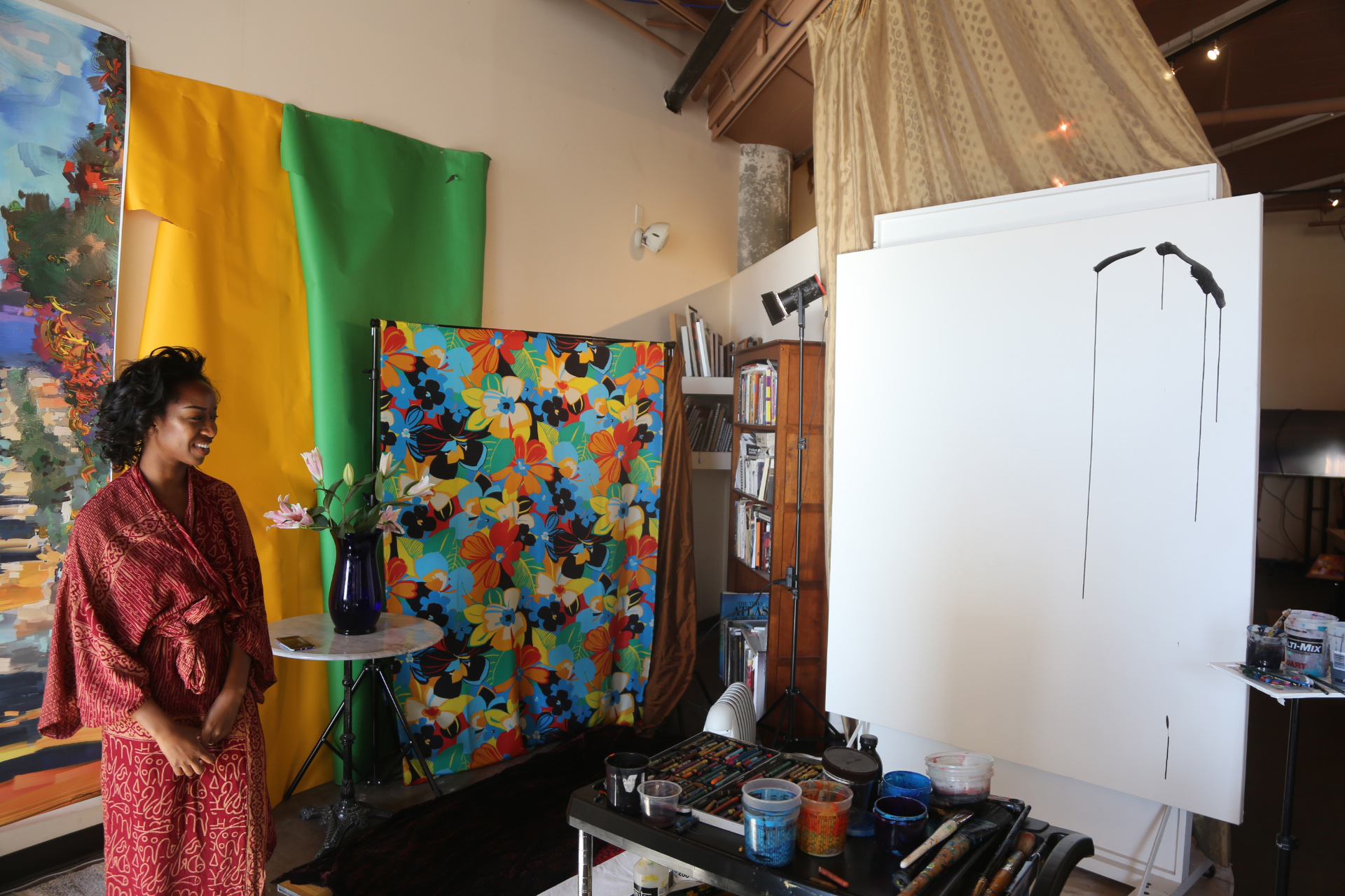
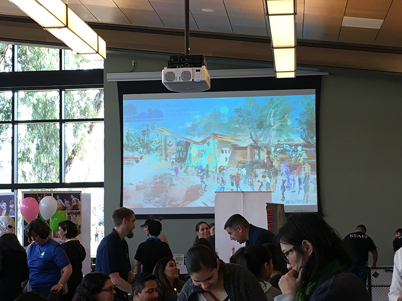
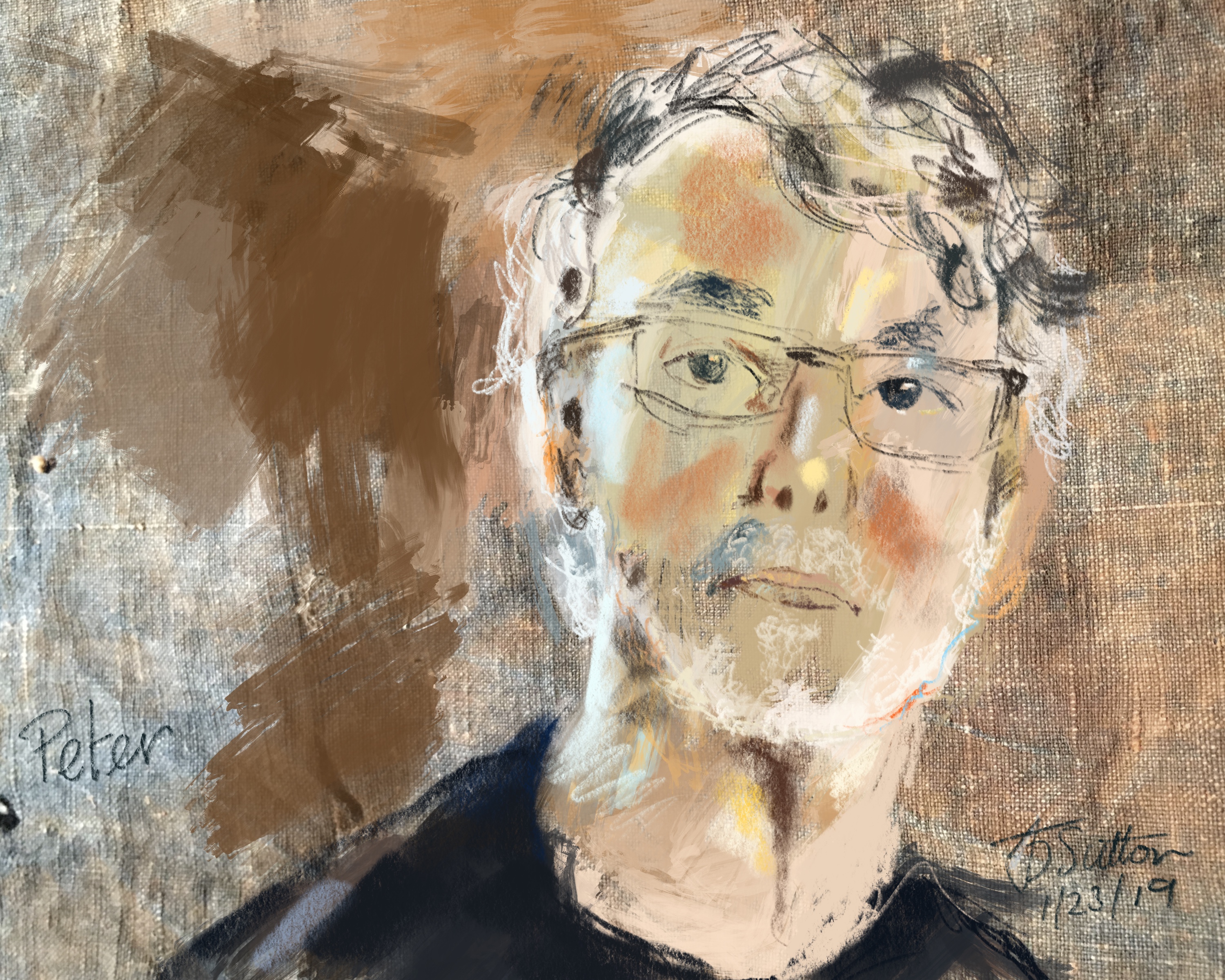
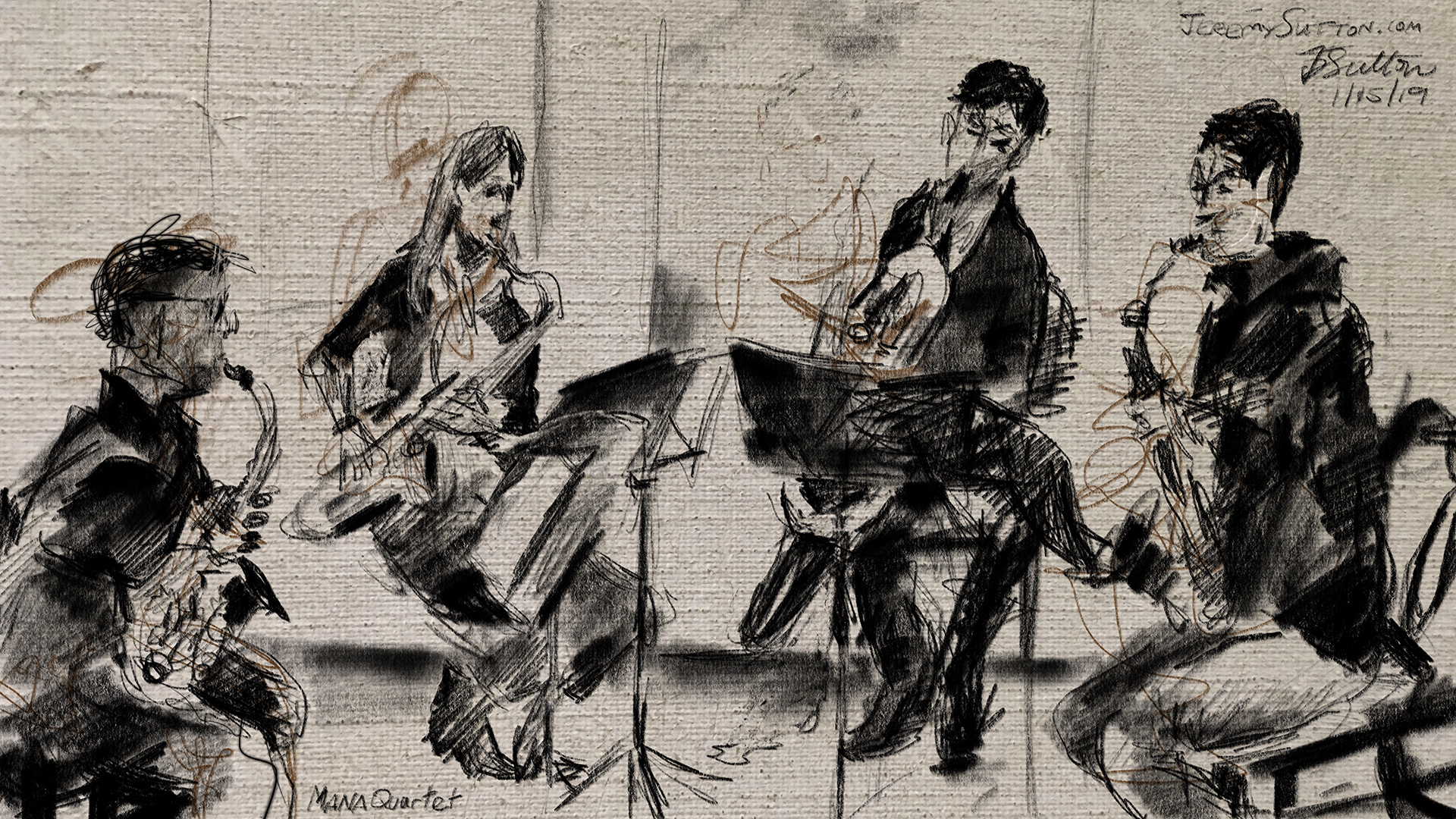
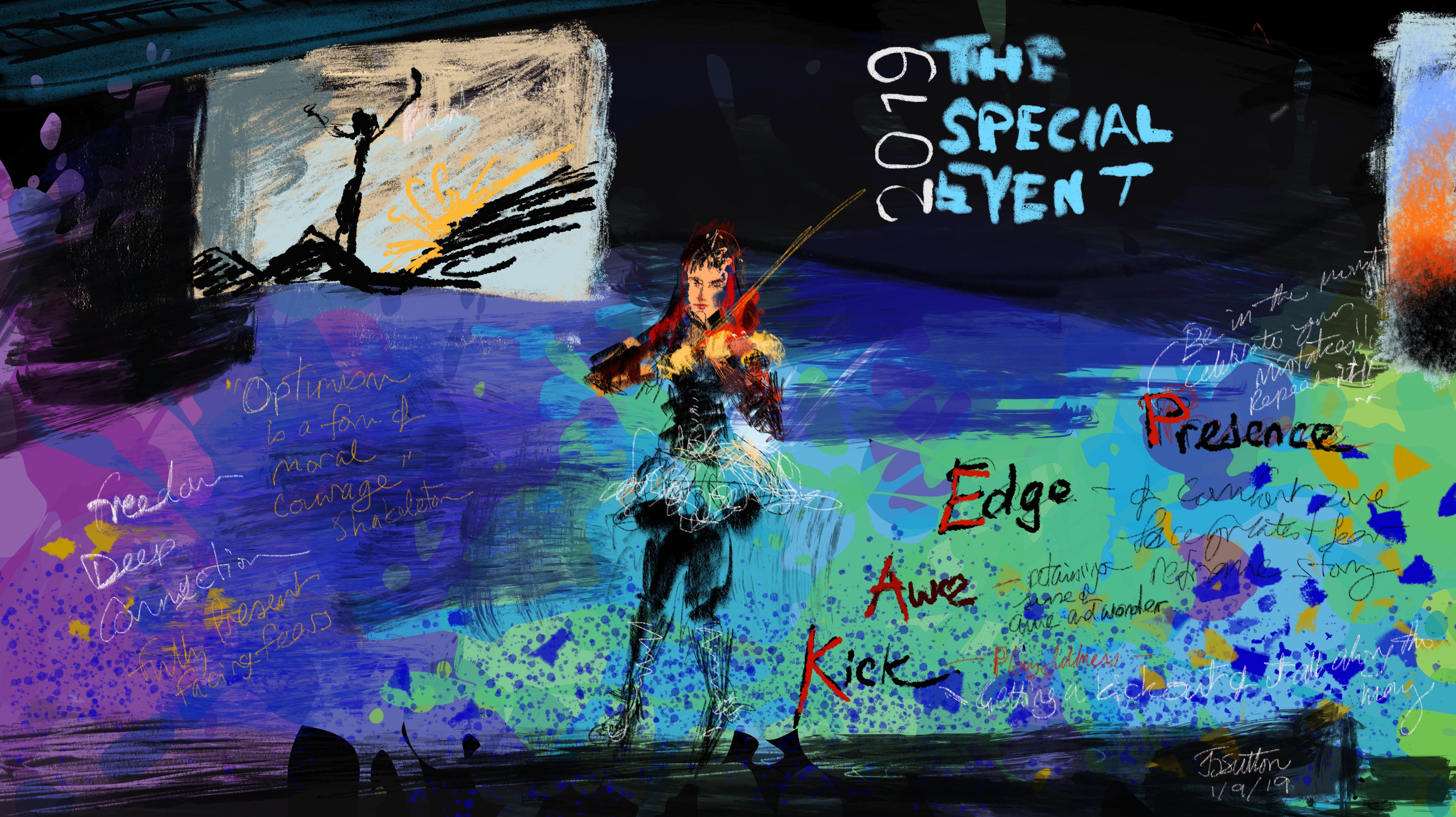
Photo on left by Cara and Joel Weiss of Save The Date MD.
Photo on right by Kunmi Ariyo of Mirus Events.

Here are states in my painting process that show different acts performing and moments during The Hot List presentation, plus some photos from the show.

Jordan Kahn Orchestra


Michael and his daughter Kelsey


The Two Doms


The Two Doms


Michael talking about Visual Comet’s LED Tunnel and other products

Eric Dittelman

Scott Keo

Johnny Manuel

Tom Cotter

Little Stars Trio


LYRIC


LYRIC

Painting Portraits

Immediately before and after The Hot List I painted portraits of attendees and share some of them here:

Jeremy painting Amanda. Video by Sharokina of Citygirl Weddings.

Painting The Opening Session

The day before The Hot List I painted The Special Event Show’s Opening General Session. Here’s the replay video and couple of states from within the creative process as the painting developed and depicted different performers:

Val Vigoda

LA AllStars

Jeremy Sutton Live Event Painting, as featured in:

Here is a set of links to all of Michael Cerbelli’s “The Hot List™” 2019 presentations where I have performed live:

January 2019, The Special Event (TSE) show, San Diego, CA

February 2019, New York City, NY

March 2019, International Live Events Association (ILEA), Greater Philadelphia Chapter, PA

June 2019, Meeting Professionals International (MPI)’s World Education Congress (WEC), Toronto, Canada

Sketches of Human Rights Essay Winners


This sketch was created during the San Francisco Human Rights Commission’s Commemoration of the 70th Anniversary of the Universal Declaration of Human Rights on December 10th, 2018. The digital tools I used were the iPad Pro 12.9 (3rd Gen.), Apple Pencil and Procreate 4 app.

The celebration featured special guests, Commissioner Karen Clopton of the San Francisco Human Rights Commission; celebrated Jazz musician Paula West; Humanitarian Janet Reilly and DJ Jahi. In addition these local youth and schools participated: International High School, French American International School, Rooftop K8 School and Mission Dolores Academy. I focused on capturing each of the five winning student essayists who words about the articles of the declaration that most resonated with them were truly inspirational and eloquent:

Miró Quartet
Music at Kohl Mansion


This time-lapse replay video shows the unfolding of the creative process of an iPad painting that was created on December 9th, 2018, during a concert of the Miró Quartet at the historic Kohl Mansion in Burlingame, CA, part of Music at Kohl Mansion for which I am Painter-in-Residence for their 2018-2019 season. The music they played as I painted was the String Quartet No. 2 in A minor, Op. 13, composed by Felix Mendelssohn in 1827.

After creating this in-concert with the iPad screen image shown in real time on stage on a large LED screen placed behind the musicians, we then played the replay video in the reception for attendees to enjoy watching!

The tools I used for this were the iPad Pro 12.9 (3rd Gen.), Apple Pencil and the Procreate app. Limited Edition Metal Prints (14×11 and 24×30) are available – see the Prints page for pricing. Each print will be enabled with Augmented Reality that will show the replay video.

Many thanks to the fabulous and inspiring Miró Quartet and to Patricia and her magnificent Music at Kohl Mansion team!

Painting Portraits
Casino Themed Holiday Party
Tabletop Tap House, San Francisco


You can see here examples of the iPad portraits I painted at a casino night themed company Holiday Party in the Tabletop Tap House in San Francisco. The client asked me to incorporate their party invite design and logo into the background of my portraits. I used an iPad Pro, Apple Pencil and Procreate app. Each portrait took approximately ten minutes per subject. Each subject received digital copies of their portrait (the final JPG plus a time-lapse replay mp4 video) plus a framed 8×10 print.


Live iPad Painting
Cupertino Tree Lighting


“Hi Jeremy,

I just wanted to thank you again for performing at our tree lighting event last night. You were a wonderful addition.

Molly J.
Recreation Coordinator
Recreation and Community Services
City of Cupertino”


I painted the City of Cupertino Holiday Tree Lighting at the Quinlan Community Center on Friday, November 30th, 2018. You’ll see from the video that the painting tells the story of the evening, starting in front of the community center with the Business Casual a cappella group, speeches by city and community dignitaries, then Santa being delivered by a fire engine, Santa pulling the lever to light the tree and finally, on the back patio area of the community center, Santa posing with kids for photos (while the Lawson Choir from Lawson Middle School sang in the background). The digital tools I used were the new 2018 iPad Pro 12.9, Apple Pencil 2 and Procreate 4 app.

iPad Portrait Demo
Steel House, Rockland, Maine

This is the painting I created on Sunday, November 25th, 2018, in a live iPad portrait demo at the Steel House South in Rockland, Maine.

My host, Paul Coster, introduced me. I’ve known Paul since secondary school in North London (i.e since we were 11 years old). In his introduction he shared his memory of one of my mum’s artworks, a large painting in our living room of colorful rain pouring down on a couple. He said that something stood out about this painting and described it as having a quality that went beyond the literal scene being depicted. He said that my work embodies that same special quality.

What follows is not a literal transcript but a “close enough”, based-on-memory with some artistic license, version of the transcript of my presentation.

The Presentation

Thank you all so much for coming along this morning to a little bit of digital painting magic! Thank you Paul, Kim, Elysa and Nate for all their help in hosting me here and organizing today’s session in the wonderful Steel House South.

Let me give you the background to this presentation. Paul Coster was one of my best friends throughout my secondary school years at Latymer School in North London. We lost contact and only saw each other a few times over many decades. Then last year I was in Portland, Maine, visiting my girlfriend Peggy’s parents, when we found ourselves waiting for her sister at the Portland Art Gallery where her sister was exhibiting. Peggy loves furniture and said let’s go next door to West Elm, a furniture store. While I was wandering about a little bored I heard someone call my name. I looked around and saw a chap sitting down also looking somewhat bored waiting for his wife. He looked vaguely familiar and then it clicked: that was the Paul Coster I knew from Latymer. Thus restarted our friendship and consequently here I am!

Today I’m going to share with you a real life art-in-action creative process with all it’s uncertainty, vulnerability and unpredictability. I have no idea where it’s going to go and we’ll be sharing this journey together! You’re going to witness a call and response process, with me looking and observing intently and then responding to what I see with a mark. Every mark I make will be a direct response to what I see.

Before we dive into the pixels, let me give you a little context, besides bumping into Paul, as to who I am and why I’m here sharing digital painting process with you. I’m showing this early digital painting of Albert Einstein on the screen here as a nod to my former life as a Physicist. But let’s go way back…I’ve drawn since I was 3 and never stopped. I drew all over the walls of my bedroom at home as far as I could reach (my parents said you can draw all my bedroom walls as long as I left the rest of the house alone:-). Drawing underlies everything I do.

Besides drawing I was fascinated by the world around me and by the questions that Physics addresses: why do we experience the natural world as we do and why is it like this. Consequently I ended up going to Pembroke College, Oxford University, and studying Physics and ended up selling superconducting magnets in India, Denmark and the Benelux (I know, a funny combination), living in the Netherlands, and eventually moving to the heart of Silicon Valley in the late 1980s. In 1991, while I was living in Palo Alto, someone saw me drawing a portrait, as I obsessively did, at a party and said “wow, that’s great! you should meet a friend if mine who makes painting software.” I had no idea what they were talking about but said “absolutely, yes!” and that changed my life. I was introduced to the Mac, Wacom tablet and PixelPaint Pro software, made my first computer portrait and was immediately asked what I was doing in two weeks. They wanted me to demonstrate their software by drawing portraits on the Wacom booth at the SIGGRAPH conference in Las Vegas. I took a week off work and went! A few years later I got my Green Card, then got laid off, thankfully in that order, looked for a job for a couple of weeks before deciding to follow my passion and go for it as an artist. And here I am twenty four years later still going for it!!

From the get go my career as a professional artist has involved working closely with vendors and exploring technological tools for mark making. From using Painter on the Mac with a Wacom tablet to experimenting with eye tracking devices, gesture control (through Leap Motion detectors) to my current work with Google Tilt Brush and 3D painting (really more sculpture than painting) using the Oculus Rift VR system.

[At this point in the presentation I showed some photos of me in action working as a live event performance painter at various museums, including the Smithsonian Institute’s American Art Museum, Washington D.C., the Rijkmuseum, Amsterdam, and at the opening of the David Hockney: Bigger Exhibition at the de Young Museum, San Francisco. I showed me working with Cirque du Soleil’s Totem show in San Francisco and performing on stage during the Art of Jazz east coast tour with Tommy Igoe’s Birdland All-Stars. I ended the segment with videos of my Iconic Silicon Valley Series, and danced the bop to the “Rockin Robin” soundtrack that accompanied the Twitter video! I explained, as an aside, that I’ve loved dancing to 50s rock ‘n’ roll since I was a teenager in London and that ironically, many years later, I learned whilst giving a live art demo at the Oxford Internet Institute from my first ever boss that one of the reasons he hired me was because I had been the President of the Oxford University Rock ‘n’ Roll Society and he thought anyone who did that must have some character!]

The tools I am using today are an iPad Pro 12.9 First Gen, Apple Pencil and the app Procreate. I’ve got a new iPad Pro 12.9 and Apple Pencil 2, which just came out, on order and can’t wait to experience them. I had a go at the new equipment in the Portland Apple Store yesterday and it’s quite a different feel. I’m used to the frictionless gliding of the first generation Apple Pencil over the iPad glass surface and the tapping sound it makes on the glass. The new versions have built in friction and a softer, quieter feel – responding to what many artists requested. Personally it’ll take some getting used to but, as with all tools, we adapt and make it our own.

Before we go any further I want to emphasize that the iPad doesn’t replace traditional media. I still love to draw on good old fashioned paper with messy media! When I go life drawing, drawing the figure from life, something I’ve done for many many years and is the backbone of my art practice, though I may use the iPad, I still primarily love to work on large sheets of paper with various wet and dry media.

Let’s talk about language and labels for a moment. David Hockney refers to everything he does on the iPad as drawing. What I do on the iPad feels like a cross between drawing and painting, and I generally refer to it as painting. It doesn’t really matter what you call it.

So why use the iPad for making art? I love the portability, immediacy, speed and convenience. Plus, so important for me in sharing process as a performance painter, I love the way I can share my process in real time on a big screen as I paint, just as you’re seeing now. And beyond that there’s the magic of the replay! I love being able to instantly share the entire process played back stroke by stroke: many minutes compressed into a few seconds, something I can also immediately send to my portrait subjects via AirDrop or email and that they can then share with friends and family on their social media.

This replay capability also opens up a wonderful way to share process via the printed image when you enable the print to be a trigger image for an Augmented Reality overlay of the replay video, as you see me doing here using the HP Reveal app on my iPad pointed at the MetalPrint “Art of Jazz” image and the image on the back of my Birdland All-Stars tour jacket, another of my “Art of Jazz” images that I created live on stage with the band during a 5 week, 21 show “Art of Jazz” tour up and down the east coast earlier this year. I worked on canvas, paper and iPad throughout each show and my iPad painting was projected on a large screen behind the band as I worked. You’ll see that in the Augmented Reality video overlay I show not just the stroke by stroke replay of the process but also give context through a video of me on stage making the painting! Isn’t that cool?!

Okay, why use Procreate? There are many, many great drawing and painting art apps on the iPad, all with their individual strengths and weaknesses. Art Set, Art Rage, Sketch Club, and so on… However I’ve selected Procreate, the same app you see used in the Apple Stores to demonstrate painting on the iPad, as my go to app for my professional performance work since it is very robust, reliable, flexible, powerful but most of all because the app has integrated into it automatic replay video recording by default. Whilst many other apps like Sketch Club and Art Rage have recording features, in those cases you have to consciously turn them on and, in the case of Art Rage, exporting the video file is quite complicated and involves using the desktop version of their app. By contrast Procreate makes it a no brainer, it does it in the background without me doing anything or having to remember anything, which as an artist is what I want.

Incidentally Procreate is made by Savage Interactive, a company down under in Hobarth, Tasmania. I’ve seen it mature into an incredibly deep app that has many features that parallel what you may find in Photoshop. I’m just going to work with the painting aspect of the app in a fairly simple way today, but whether you’re in design, comics or illustration, you’ll probably find a lot you can do in the app.

The app, like many other art apps, has a gallery mode and a painting mode (I’m using the word painting but, as I mentioned, that could equally be drawing). Let’s start in the Gallery mode and click on the plus symbol in the upper right corner. You’ll see in the pop-up menu some default sizes and a button to make a custom size canvas. This app can handle extraordinarily large file sizes. In this case I’ve selected a preset canvas size that I had previously saved that is 10 inches wide by 8 inches high at 300 dpi so that if I wanted I could conveniently make a nice 8×10 print from whatever I create today.

Badumm! Now we are faced with that scary thing: the blank white canvas!! Only this is a digital blank white canvas and being digital it is perfectly uniform and super luminously bright. The digital world’s natural state is perfect uniformity. In this digital blank canvas every pixel really is exactly the same as every other pixel. Paradoxically the digital world goes in the opposite direction to the natural physical world which, by default, moves towards chaos and non-uniformity (the direction of increased entropy). Digital moves towards a natural state of absolute uniformity. As an artist I want a rough organic surface with some “bite”. This white blank digital canvas isn’t like a juicy piece of Arches watercolor paper with it’s rough cold-pressed surface and beautiful deckled edge.

So, what are we going to do about it? We could, at a minimum, go to the Layers in the upper right, click on the Background Color and make it a mid-tone color (by first adjust the hue ring cursor followed by the value/saturation circle cursor). This way we can easily work into both the darks and the lights.

Let’s use two fingers to pinch in a little shrink the canvas so we can see it’s edges.

We could also go to the Actions menu (wrench icon in upper left), choose Image / Import Photo. I was at the Portland Art Museum yesterday and this canvas texture is a portion of plain canvas from a Picasso that was hanging there. Ironically I go to museums of the world honing in on the portions of the canvas that the famous artists didn’t touch!! I love collecting cool textures to use as backgrounds in my iPad art. If we need to rescale or rotate the imported photo we can do so right away (it appears in transform mode) or we can click on the Transform icon, the arrow icon, in the upper left. When finished click on the Layers icon in upper right and you’ll see the imported photo is automatically imported as a separate layer.

Now let’s import another photo, this time a photo of the ice at Cape Elizabeth a few days ago. Let’s click on the small letter “n” (for normal blending mode) and experiment with the blending mode. Ahaa, the Overlay blending mode works well, let’s use that.

Finally let’s import this photo of rusty craggy rock, also from Cape Elizabeth, and make that Soft Light blending mode. I’m going to use two finger tips to tap on the rusty rock layer and then drag one finger tap to the left on the iPad screen to reduce the layer opacity. Dragging to the right increases layer opacity. The two finger tap shortcut is the same as going to the Adjustment menu icon (sparkling magic wand) in upper left and selecting the opacity adjustment.

Good now we’re almost ready for painting! Let’s go to the Layers, click on the “+” symbol and open a new layer. We’ll paint on this new empty layer. One of the great benefits of working digitally is the ability to paint on separate layers and have your brushwork easily editable and manipulable isolated from the background and other layers.

Now we are missing one small ingredient… our portrait subject! Ahaa…[I look around the room, conjecture whether Paul would make a good subject, and then settle on a gentleman sitting near the front who has a very characterful face and an interesting cap. His name is Erik.] Erik, would you please come up and be my portrait subject, if you don’t mind standing for about 45 minutes and participating but not seeing everything I do as I do it? [Erik comes up.] I want to make sure you’re comfortable – you’re just as much an active participant in this process as I. Just look at me but don’t feel you need to smile or keep absolutely still. [I got him to have a little contra posto, a little twist in his body position and head angle that makes the pose much more interesting than a flat straight on pose. I also had a photo light that illuminated his eyes, very critical for me.]

Up here in the upper right you’ll see the tool icons: Brush, Smudge and Eraser. As you can see they each have access to the entire brush library I have installed: hundreds of brushes! I’m going to start with a big bold Expressive Oil brush and just rough out my composition very quickly, not worrying about details or even likeness. This is very freeing. It takes the pressure off to be exact and accurate right away. As you see I’m mapping out major blocks and shapes of lights and darks and main color areas, plus indicating main structural features of the background scene.

In this initial process I am determining the composition – how large the face will be in the canvas and where it’ll be positioned. I think of the positive and negative space and shapes as I paint, conscious of the negative shapes made between the subject and the edge the canvas, the frame. That’s why it’s so important for me to shrink the canvas a little and make sure I can see the edges in this early stage. That’s a unique reflection of working in the digital environment. When we work on a traditional canvas or piece of paper we always see the edge in our peripheral vision. We can zoom in by getting close to our painting surface or zoom out by standing back to get the distant overview, but we never lose sight of the edges. In digital as we zoom in we lose sight of the whole and that is a uniquely digital challenge.

As I do this early stage my painting is very loose and, quite honestly, can be very chaotic and abstract and even ugly: and that’s all okay! If my subject sees it at this early stage they can get quite worried:-) And that’s also okay. So one of the key lessons in sharing my messy creative process is the liberty of being okay with chaos and with the work in progress NOT looking perfect or even a likeness of your subject! If I worried what others think as I go through this awkward teenage phase of the artwork I’d never keep going.

The one immutable is my 150% commitment to process. This painting will reach an end point, in this case determined by the limited time of this presentation, and I am absolutely committed to seeing the process through until that point. Whether it is “finished” by then is moot, as Leonardo da Vinci said: “Art is never finished, only abandoned.”

The creative process is full of “it’s not working”, full of “mistakes”, full of things that need tweaking, transforming, painting over or erasing into (the eraser is a powerful drawing tool). So “it’s not working” is never an excuse to give up, though taking a break may sometimes be very helpful:-)

The one thing you won’t see me do today is a single undo. A digital undo completely removes a mark without any trace in a way that doesn’t exist in natural media. In natural media when you erase away, scrape off, or otherwise remove anything there is always a residue left. That residue of corrected marks is part of what adds richness and history and interest to the surface. We lose that residue with undo so I simply recommend don’t undo. Every mark you make is a gift to the richness of your surface, even, or especially, the so called “mistakes”!

Now let’s move onto a new layer and a smaller, more precise brush, my JS 6B Pencil. This will be my sketching layer. I love the control I have with the JS 6B Pencil: when I hold my stylus (Apple Pencil) upright on the glass I can get a very fine line that varies in intensity and size with pressure. Then as I tilt my stylus you’ll see how the stroke becomes a beautiful shading stroke instead of a linear mark, just as if I was working with a real pencil and using the side of the exposed graphite. Thus I have here an amazing versatile and controllable tool, every bit as controllable as a real pencil! It’s quite uncanny the degree to which the iPad Pro and Apple Pencil combination gives you this level of sensitivity and control.

I am now defining features, working into shapes, developing my light dark contrasts… It’s like sculpting in many way: chiseling away at a rough form to hew out the subject. You’ll see how I work into the eyes, the wonderful mirrors of the world. I love the variety of color and form in the eyes, looking at the reflections, indicating the way reflected light plays on the iris and pupil. I was asked recently about whether there is a feature in Procreate which allows you to copy and flip a feature. Yes, you can do that, but why? The beauty of nature is it’s asymmetry. The differences between our left and right eyes is what makes them so interesting and gives them so much character.

Interestingly as I paint Erik’s portrait I see what I am painting projected on the screen behind his head. And that changes with time. This is a fascinating facet of all live drawing or painting processes: everything changes all the time, light changes, people move, and in this case the projected painting behind him is changing with every mark I make. This every changing nature of drawing from life also differentiates the process from drawing from a photograph. I would never make the same painting if I were to simply take a photo of Erik and paint from that.

Back to this changing image I see behind Erik. Let’s generate a new empty layer by clicking on the “+” symbol in the layers pop-up panel. Now I hold my finger on that layer and drag it down to below my initial big bold brushstroke layer but above the background layers. Using a custom brush called WC_Stamp_27 I’ll just indicate roughly the colors I see behind Erik. I can lower the brush opacity to give a more subtle effect. Also in the background on the layer I’ll indicate some of the forms I see – including suggestions of the background give a visual depth and perspective to your artwork and place your subject in space. You can now also see the power of layers, for me to so easily be able to retrospectively add color below and behind existing color.

Now back to the sketching layer and I’m going to use one of my favorite inky brushes, Abbie’s dribble ink brush (available from Abbie via the Procreate community which I highly recommend joining if you’re going to use this app). I’m going to add selective emphasis to some of my contours with this ink brush. Give a little extra “umphh”! I love the rough, slightly unpredictable, quality of this brush. Adding that unpredictability helps balance the digital world’s innate bias towards absolute uniformity and precise predictability.

Finally one more layer for my signature and date. I and using my JS 6B Pencil for this. I like to include the full date, month, day and year, so that is integrated into the visual imagery. Digital images tend to get default names that are meaningless and it’s useful to have some means to place an artwork later. In addition I like to title my images in the gallery. More of that in a moment.

Let’s have some fun and look at the magical replay! I go to the Actions icon (wrench or spanner) in upper left and choose Video / Time-lapse Replay. As I move my finger on the glass to the right I can speed up the replay and to the left I go in reverse direction (undoing the painting). Cool, eh?! And Erik get’s a chance to see the whole process he missed seeing as he sat here looking at me.

We haven’t quite finished yet, though. Just like we had a bunch of prep steps before we actually made our first brush stroke, we have a bunch of completion steps to ensure the artwork is saved securely. First when I click on the word Gallery in the upper left corner note how the image is automatically saved into the Gallery. That’s a big deal! You can’t accidentally forget to save it. Thankfully:-) Let’s click on the default title “Untitled Artwork” and I like to title it with military date (YYYY-MM-DD) so it is always listed chronologically, and then subject matter and size: “2018-11-25-Erik-by-Jeremys-Sutton-10x8at300”.

Click on it so it reopens in the painting mode and we choose Actions / Share / JPG and Save Image which saves it into the Camera Roll of your iPad. I could also instantly share via AirDrop with any other Apple device. Then we choose Actions / Video / Export Time-lapse video. You have full length or 30 seconds options. The 30 seconds option compresses whole process into 30 seconds. I normally choose Full Length and edit later in a video editing program like Final Cut Pro. I choose Save Video which places the MP4 file in my Camera Roll.

[What I didn’t show in the presentation is that I then also save the Procreate file and back it up to my iCloud so I have a full version of the original file archived which could be imported into any Procreate install in the future.]

And we are done! Big round of applause to Erik for being such a good sport! And thank you all for being here!

Sketch of Erik created using iPad Pro, Apple Pencil and Procreate app. Started very loose and rough and worked into detail. Used two brushes (Expressive Oil and 6B Pencil), no undos and a couple of background layers and a couple of sketch layers.

Here are a couple of sketches I made in Paul and Elysa’s home after the presentation:

Portrait sketch of my friend Paul Coster who I knew from Latymer School in London: Faber-Castell PITT 3B solid graphite pencil on 8×10 128lb acid-free mixed media paper.

Sketch of hanging chair on deck: same media as Paul’s portrait plus pen. Looking out on this view I loved all the layers of shapes, lines, angles and tones.